I just got back from a lovely dinner with my Tamarind friends (minus Yuli who has been besieged with dental problems). It always amazes me that I can spend 60 hours a week in the studio with these kids and still want to hang out with them afterward. But as Valpuri put it, "It's not like we have any other friends here."
Everyone else (again, minus Yuli), unwound after a long and stressful first project by going together to Bikram Yoga. While I don't mind occasionally doing yoga in the privacy of my own home, I'm not that interested in going with the others. I argue that my recent kidney donation prevents me from doing crazy hot yoga. But after a year and a half, that excuse is starting to wear thin.
Yoga or not, it did feel good to finally be done with these first projects. We had our critique this afternoon and it was nice to finally have all the artists and printers together so that we could see (and hear) what happened with the collaborations.
Nicole
My print with Nicole ended up being a CMYK print, but it was still quite a challenge. We did CMYK prints last semester, but I don't think I ever actually wrote in detail about them. For those of you who have no idea what I'm talking about... CMYK printing is what is usually used for newspapers and magazines and pretty much any other printed items. If you've ever looked on the bottom of a cereal box, you'll notice a calibration bar with four colors: Cyan (bluish), Magenta (hot pink), Yellow, and Black.
Below is an image I found on the fancy interwebs that illustrate this concept. On the left you see the different color separations. On the right you see how the image changes as the colors are printed on top of each other.
So Nicole had this image of a building that she wanted to use. It was very important to her to capture all of the different variations in the brick. She wasn't interested in hand drawing or working on the plates or stones directly. I suggested some different ways we could get where she wanted, but in the end she pushed for CMYK and that's what we did. Even though it seems like more of a commercial and maybe more of an easy way of printing, it was still pretty hard. My first problem was that the colors were too lean or transparent. The colors were mixing, but I wasn't achieving the right levels. Nicole was pretty disappointed with the first proof so I spent the next day making another one.
Here is Celina contemplating the prints. The one on the left is the second (darker) version of the print. The one in the middle is the first (lighter version) and the one on the end is just a mess-up where I printed the wrong ink on the wrong plate.
After discussing it with Rodney and Bill, I decided to leave all the transparent base out of the inks and just use opaque colors mixed straight out of the can. They were still printed pretty lean, but I was able to match the colors much more closely this way. We printed half of the edition on gray Rives BFK and half on white German Etching paper. I like the effect of the gray under the inks. Here is a closer look:
I was pretty happy when the edition was done:
Jenna
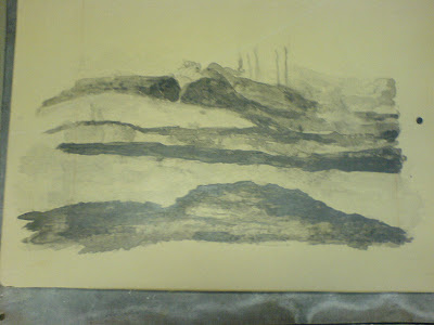
Jenna and I got off to kind of a late start. She was also working with Ana and they met before we did, so she kind of already had an idea of what she wanted to do. For me, she tried working with the tusche on the stone. This was the first version of her print (as it looked on the stone before etching):
After seeing the proof, she decided that she wanted to work into it a little bit more. So I counteretched the stone and she went back at it with more tusche, some litho crayon and some rubbing crayon. Which resulted in this (in ink on the stone):
This turned out to be just one run on gray Rives BFK paper in a blue-black ink. Jenna expressed some interest in maybe watercoloring over the print, but has yet to do so.
Otherwise...
Things are going well. Patrick and I spent about 20 hours in the studio this past weekend, and my little guest house was in shambles. I finally did my laundry, picked up my messes, went grocery shopping and found time to update this blog. It's nice to actually have some breathing room again. For the next collaborations, I have Nicole again, and then Karl. We have four weeks to complete the prints this time, which is nice. But I'm planning on going to the College Art Association conference in Dallas next week. So that will cut into the planning stages a little bit. Hopefully by the time I come back, my artists will have their ideas completely ironed out so that I can get cracking on the proofing.
Tuesday, February 12, 2008
Critique #1 (Nicole & Jenna)
Posted by
Porkchop
at
9:23 PM
3
comments
![]()
Subscribe to:
Posts (Atom)


