Thursday, November 15, 2007
Monday, November 12, 2007
P-11: Acrylic Reversal (and Whatever Else Rodney Could Think Of)
Sorry again for the delay, but I'm finding it's easier to just talk about these projects after they're finished.
Once we were done suffering through the Maniere Noir, we moved on to Acrylic Reversals. The idea here is that you start with one image... But then your artist decides that it would look really cool if it was inverted. That is, the blacks become white and the whites become black.
These days, you would probably just make a photo plate with a negative image. But as Rodney likes to say, there may be a time when the power grid goes out, and you can't make a photo plate, and your artist is only in town for one afternoon, and you HAVE to do the reversal or else they'll never work with you again. In this instance, you would need a primitive way to invert the image. And that's why God created the acrylic reversal process.
To make this project more interesting, Rodney decided to throw in a few more elements. Not only would we have the reversal plate (run 1), but we'd also have an underlying texture or flat (run 2), AND chine colle (run 3), AND some dusting (run 4)... in no particular order. And to top it all off, our reversal image would be applied to the plate using Dolphin Litho Transfer Paper... one of the runs had to be a Split Roll... and this was a collaborative project!!! Okay... you ready for this? Click below for all of the excitement...
Mick was my artist for this project. In the meantime, I was collaborating as an artist for Ana... but I can't show you any of that project because it's a surprise present for Carrie. So I had Mick draw an image on the Dolphin transfer paper and then I ran it through the press onto a plate. It worked kind of like a temporary tattoo, in that once it was applied, you wet the backing paper with water and then slowly peeled the paper off to leave the image on the plate. Here's Ana drawing on her transfer paper with litho crayons:
Here's what Mick's image looked like after it was on the plate. He used an autographic ink to make his lines:
After the transfer, we etched the drawings as normal and rolled them up in black ink:
After pulling a few proofs of the image to make sure it was well established, we began the reversal process. Gradually, we applied and buffed four thin layers of acrylic matte medium into the image area. Here is Patrick at work on Ana's plate. Notice how he taped out his borders with clear packing tape to keep them clean.
Once the matte medium set up for a good hour or so, we came back and cleaned out the ink with lithotine.
Next, we buffed TAPEM into the resulting gaps to create a mask, then washed out the matte medium with acetone. We next applied a layer of shellac to our plates:
Then we were ready to roll it up in ink and see the magic of the reversal. Mick's plate was a little ugly, but it worked!
After the long, tedious process of the reversal, it was pretty smooth sailing. Mick drew his second plate with crayons for me:
Then we set about mixing colors and trying to figure out the split rolls and the chine colle and dusting.
A split roll is when you have more than one color on the roller at one time. It's kind of like the blend roll that I used on the Unicorn project. Except in this case, you should not be able to see the point at which the two colors blend. Mick decided that we would use a split roll for both plates on this project. Here is the roller for the first plate:
And here is the plate with ink on it:
Here is the roller for the second plate:
And here is the plate with ink on it:
With the split roll, you have to be very careful about the inks that you are using. You have to make sure that they are of an equal density and volume or else one of them will begin to creep into the other one and contaminate it. This was especially the case with my first split roll. One of the colors was very transparent and kept getting overpowered by the heavy reddish brown that was next to it.
Once we had the plates made, we decided on the chine colle. Chine Colle is when you attach two pieces of paper together during the printing process. You may recall that this is what I did during my SNAP!!! print a few months back. For this project, we tore the chine colle paper down and adhered it to the support paper ahead of time, using an airbrush and rhoplex adhesive. Mick's chine colle was a simple square of white japanese paper that went on the right side of the print.
The final element was the dusting. Dusting a print usually means that you are adding either a colored pigment or some sort of iridescent powder to the wet ink. When you have multiple runs, it is important to make sure that the previous run is completely dry before you print on it. For this project, we added dryer to our ink to make sure that it was dry enough before moving forward. When the second run is added, you then place a small amount of your powder of choice onto the print, then move it around with a soft clean brush. Ideally, the powder will stick only to the wet freshly inked areas and not to the paper or the previous run. You can then brush off the excess, suck it up, or blow it off with an airhose. Sometimes, the pigments will stain the paper, so you have to be careful in which one you choose.
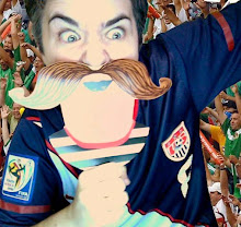
Mick decided on a green pigment for his dusting. We found that it stained the paper though and it didn't look that great with the inks he had chosen, so I ended up mixing it with a pearly color and only applying it in a small area on the print. I apologize, but I don't have picture of the final dusted image yet. In the meantime, you can look at the new "last print" face I've been working on. What do you think?
This one?
Or this one?
Subscribe to:
Posts (Atom)